Selling anything — whether it’s a house, a product, or a company — requires putting your best foot forward. If a company’s visual identity is outdated, if the logo is homegrown and the website cluttered, it’s a ding on the first impression and the buyer’s perception of value.
A lot of factors go into getting a great purchase price for a company, but updating visual identity is a key factor in a strong Valuation Marketing strategy. Making sure your business looks unique, confident, and current not only attracts new business, but it ensures potential buyers will take it seriously as a worthy investment.
Take, for example, the online employer review company Glassdoor.com. In 2016, the company went through a round of funding that placed its valuation at slightly more than $1 billion, according to Bloomberg. With $200 million in total funding, Glassdoor was thriving while competitors struggled, and the CEO was open about plans to eventually go public.
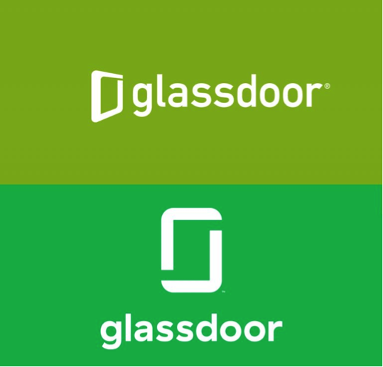
The following year, in spring of 2017, Glassdoor unveiled a full brand refresh that emphasized its updated logo and visual identity. As they describe it, their new look was “notably more modern, clean and purposeful.”
![]()

Logo before (top) and after (bottom).
![]()
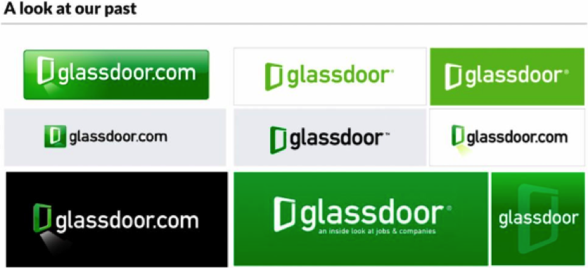
Prior to the update, the logo hadn’t changed much in the nine years since the company started, but it also wasn’t clean and consistent across platforms. The shade of green differed, as did the background colors. Over 7-8 months of work and preparation on the refresh Glassdoor’s design team solicited feedback on the logo (which was mixed) and identified problems (that the original green wasn’t ADA compliant).
![]()

The various iterations of Glassdoor’s original logo.
![]()
While the changes weren’t radical — Glassdoor retained the open door frame concept and the color green — the new logo, color, and overall look offers “a sense of symmetry, infinity and possibility,” according to CMO Moody Glasgow. It also provides a more dynamic and identifiable set of marks to use in branding and advertising.
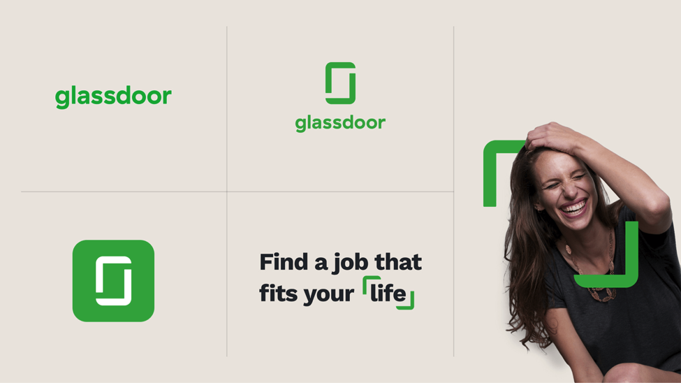
Designer Gage Salzano, who worked on the project, notes in his portfolio how the new, centered door frame of the logo “expands as two brackets to become a visual tool used to frame photography and messaging.” This allows Glassdoor to expand their brand presence and diversify their marketing visuals while still retaining consistency.
![]()

Glassdoor’s updated logo provides unique visual identity to use across marketing materials.
![]()
Slightly more than a year after the brand refresh, in May of 2018, Glassdoor sold for $1.2 billion — a marked increase over its 2016 valuation. By updating their brand’s visual identity, Glassdoor attracted both new users and eager buyers. Over the course of two years, the company increased its valuation by $200 million, and the brand refresh certainly played a role.
Effective Valuation Marketing is a long-term strategy, and visual identity is a key factor in getting the best price for a company. Just as professional photography increases the sale price of a home, crafting a consistent and modern visual identity for your brand will ensure a strong first impression for buyers and customers alike.


